Choosing a wall color for a home often seems like a simple decision. You look at a color chart, pick a tone that feels pleasant, and think, “this color will look good.” Sometimes instinct can point you in the right direction, but unfortunately, it is rarely that simple. Once the color is applied, the result may not feel as satisfying as expected. A tone that looks warm and elegant on a color chart can appear dull, muddy, too yellow, or much darker on the wall.
The reason is this: wall color does not exist on its own. It is perceived together with light, flooring, furniture, curtains, and even the way the room is used throughout the day. The same paint color can look excellent in one home and feel ordinary or tiring in another. That is why, when we ask “how should we choose a wall color at home?”, the answer is not only about finding a color you like; it is about understanding how that color will work within the space.
A well-chosen wall color does more than make a home look beautiful. It can make a room feel more spacious, warmer, calmer, or more balanced. A poorly chosen color, on the other hand, can weaken the entire atmosphere of a room, even if the furniture itself is beautiful.
Why shouldn’t wall color be chosen on its own?
Wall color should never be considered like a color on a sheet of paper. Inside a home, no surface is perceived in isolation. When you look at a wall, you are not only seeing the paint; you are also seeing its relationship with the floor color, the tones of the furniture, the direction of the light, and the other materials in the room.
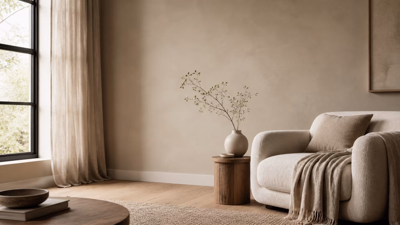
For example, a light beige wall color can look soft and balanced with a warm wooden floor. But the same color may appear muddy or yellowed next to a cool gray-toned floor. Similarly, a gray tone you love may feel much gloomier in a room that does not receive enough daylight. A color that looks modern on the chart may not create the effect you expect under the real conditions of your home.
That is why the first question should not be “which color do I like?” when choosing a wall color. The better question is this: How will this color look in this home, under this light, with this floor and this furniture?
To choose the right wall color, the home needs to be considered as a whole. Flooring, ceramic surfaces, sofa fabric, kitchen cabinets, door color, curtains, and lighting all come together and change the character of the color. A color that looks beautiful on its own can feel too heavy, too pale, or too dominant when combined poorly.
Why doesn’t wall color look like it does on the color chart?
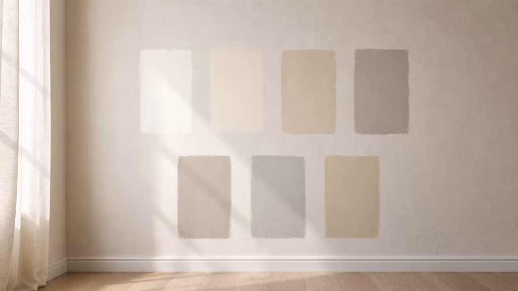
One of the most common problems when choosing a wall color is this: a color that looks beautiful on the chart does not create the same effect once it is applied to the wall. This is completely normal. A small color sample on a chart and a large wall surface are not perceived in the same way.
A color that feels calm on a small sample can feel much stronger when applied to a large wall. This effect is especially noticeable with dark, warm, or saturated tones. A color that seems elegant on the chart may feel more dominant than expected once it surrounds the entire room.
Another reason is the difference in light. Paint color charts are usually viewed in a store, under artificial lighting, or even on a phone screen. But the light inside your home is completely different. The direction of the room, the size of the windows, the way daylight enters, and the color temperature of the bulbs used in the evening all directly affect how the wall color appears. The same color can look different in the morning, at noon, and in the evening.
That is why choosing a wall color only from a chart is risky. The best approach is to test the selected color on a small area whenever possible and observe it at different times of the day. If a color looks good in natural morning light but becomes too yellow or too gray when the lights are on in the evening, this should be noticed before the entire room is painted. Otherwise, the feeling of “this color did not look like this before” becomes almost inevitable.
When choosing a wall color, the color chart is only the starting point. The real decision should be made by seeing how the color lives inside the home.
How does light change wall color?
One of the things that changes wall color the most is light. The same paint color can look completely different under different lighting conditions. The true character of a color appears through the light it receives inside the home.
In a room that receives daylight, colors usually look more vivid and clear. But not all daylight is the same. A north-facing room receives cooler and softer light, which can make some colors appear grayer, colder, or more muted. A south-facing room, on the other hand, receives stronger and warmer light, so the same color may feel brighter, warmer, or more intense.
In the evening, the situation changes again. This time, artificial lighting comes into play. A warm white bulb can make a wall color appear softer and more yellow. Cool white light can make the same color feel harsher, grayer, or more lifeless. That is why, when choosing a wall color, it is not enough to look at how it appears during the day; you also need to see how it feels when the lights are on at night.
This difference is especially noticeable in neutral colors such as white, beige, greige, and gray. A white that looks clean on the chart can appear too blue or too yellow at home. A calm gray can become gloomy in a room with limited natural light. A soft beige can look muddy or dated under the wrong lighting.
That is why, after narrowing down your paint options, applying small samples is very important. The color or colors should not be tested in only one spot, but on different walls of the room. A wall close to the window and a wall that stays more in shadow can show the same color differently. The most accurate decision is made after seeing how the color changes in the morning, at noon, and in the evening.
Wall color works together with light. A color chosen without considering light may look right on paper but fail to create the expected effect inside the home.
Why are flooring and furniture so decisive in color?
Looking only at the wall when choosing a wall color is a serious mistake. The wall is constantly in relation with the other surfaces in the home. Flooring, furniture, doors, curtains, cabinets, and even metal details can change how the wall color is perceived. So simply liking the color is not enough. You also need to consider which floor it will be used with.
Furniture is just as decisive. In a room with large, dark-colored furniture, choosing a wall color that is also too dark can make the space feel heavy. In a room with light-toned, simple furniture, a wall color that is too pale can make the space feel flat and characterless. The issue is not only choosing a light or dark color; it is about how the colors balance one another.
Curtains and textiles are also part of this perception. If the sofa fabric, rug, bedspread, or curtain color does not work well with the wall, the room can feel fragmented. Everything does not need to be the same color, and in most cases, it should not be. But the colors should not fight with one another.
Doors, baseboards, and cabinet colors are also often overlooked. Yet the wall color constantly sits next to these fixed elements. White doors, dark wooden doors, lacquered cabinets, or marble-look surfaces can directly affect the wall color you should choose. The wall color should complete these materials; it should not overwhelm them or feel disconnected from them.
That is why the right approach is not to choose the wall color on its own at the very end, but to evaluate it together with the main materials in the home. When the floor tone, the visual weight of the furniture, the colors of the textiles, and the light of the room come together, the color can be read more accurately. A well-chosen wall color connects the elements of the home and helps the space feel more cohesive.
Does the same color logic work for every room?
Painting the entire home in the same color can sometimes feel like a safe choice. If a simple, low-risk, and cohesive look is desired, using one color may seem reasonable. But every room has a different purpose, a different way of receiving light, and a different atmosphere throughout the day. That is why looking at the whole home through a single color formula may not always lead to the right result.
The living room is one of the spaces with the most varied scenarios in a home. It may be used for resting, conversation, watching TV, working, or hosting guests throughout the day. For this reason, the living room color should feel both warm and balanced. A color that is too harsh, too dark, or too cold can make the room feel more tiring than it should. But a color that is too safe and lifeless can also flatten the space.
The bedroom has a different expectation. The aim here is usually not to create an energetic atmosphere, but to build a calm and restful environment. The wall color should not tire the eye, should not become harsh under light, and should support a sense of rest. Very bright or overly stimulating colors can become uncomfortable in a bedroom over time.
In the kitchen, color choice is not only about aesthetics. Cabinet color, countertop, flooring, and light are all highly decisive here. If the wall color does not work with these surfaces, the kitchen can look more visually cluttered than it actually is. In open-plan kitchens, the relationship with the living area should also be considered, because a poor color transition can make the two areas feel disconnected.
In transition areas such as corridors and entryways, light is often more limited. The color chosen for these areas can make the home feel more welcoming, or more closed-in. A color chosen only because it is “light” does not always create a good result; it should be evaluated together with the floor, doors, and lighting.
In short, every room does not carry the same mood. That is why, when choosing a wall color, it is important to consider not only the general style of the home but also the purpose of the room. The right color should support what the room is used for.
The right wall color completes the atmosphere of a home
Wall color is one of the most important decisions that shape the overall feeling of a home. A well-chosen color can make a space feel calmer, warmer, more spacious, or more balanced. A poorly chosen color, however, can weaken the atmosphere of a room even if the furniture is beautiful.
That is why it is not enough to decide by saying, “I like this color.” You need to look at how the color changes with light, how it works with the floor, how it connects with the furniture, and whether it supports the purpose of the room.
A good wall color does not have to draw attention to itself. Sometimes the right color is the one that does not stand out too much, but makes everything else in the room look better. Because wall color does not merely cover a surface; it completes the atmosphere of the home.